When to Use InDesign for Web Design
Consider the relationship between designers and developers in the context of building websites. Your site’s design might be stellar, but if the page’s code smells, the whole experience might end up a wash. Conversely, you can have beautifully written code on your site, but the end product can be repulsive if the colors don’t work well together or if the fonts don’t convey the site’s content well.
Tools play an integral role in this relationship. Designers are often expected to know the “Holy Trinity” of the Adobe Suite—Photoshop, Illustrator, and InDesign—but developers are not.
At Flying Hippo, my role is to create websites. Since I often create websites from start to finish, I take on the responsibilities of a designer, production artist and developer—effectively a whole team of people. Sure, it’s challenging, but the major advantage is that I can use whichever tools I’m comfortable with.
InDesign for Web Design? Make Everyone Happy.
Finding tools that make everyone happy is like finding a minivan that can crush the competition in a drag race and get four kids to soccer practice on time. (Luckily, I have one.)
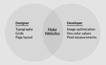
Still, the best tools I’ve found for designing websites are InDesign and Photoshop. There’s a contentious battle between the two (check out the comments!) because software is intended to fulfill specific needs, and needs differ for each role. (Take a look at the Venn diagram on the right for more about that.) No single program answers every need perfectly, but using InDesign for web design usually suits my needs best.

Use the tools that everyone involved has access to and is most familiar with. It’s as simple as that.
Function, Not Just Features.
I use InDesign for wireframing and designing. To me, that’s what InDesign was intended for. But when I’m preparing web-ready imagery, I switch between InDesign and Photoshop using the “edit original” feature—which launches Photoshop to edit the original image—and copy-pasting vector smart objects.
I’m not saying you shouldn’t use Photoshop or Illustrator (or even Fireworks) to design websites. When it comes to production for web, I’ve experienced excellent results with each of these programs. They have great features, such as pixel grids and save for web.
More Than Just Print Design.
InDesign might have been originally conceived as a tool for print designers, but—and this might cause some shockwaves—I propose we designers and developers stop thinking of InDesign that way.
Its purpose and value as a general layout and design application extends way beyond what we can pull off on paper, and Adobe has already expressed their vision of InDesign’s role in web design—especially with the addition of the pixel measurement since CS6. Adobe might have a ways to go to support other core web-centric features, such as a pixel grid that doesn’t allow half-pixel measurements and a color palette that supports hex color values, but if we designers, developers, and production artists can get behind their vision, we might see those features sooner than we think.


