 Marketing
5 Failproof Places to Use Cleverly-Crafted Microcopy
“Micro,” in the most clinical of definitions, means one-one-millionth of something.
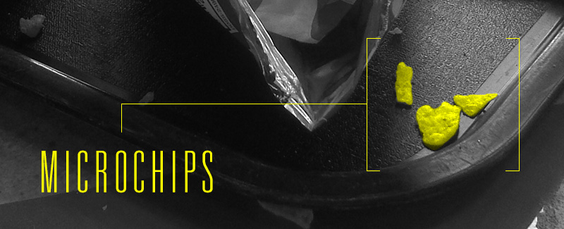
But in the most practical, it just means “small.” But small doesn’t mean “unimportant” or “bad.” A beer from a microbrewery is probably better than one from a macrobrewery. The microchips at the bottom of the Doritos bag taste just as good as the regular ones. And so on. On many sites, you’ll see microcopy. Microcopy isn’t the big, flashy, long-winded paragraphs; it’s the quirky tidbit that keeps you interested and involved in the site. It’s a garnish, and it should be used sparingly, but boy is it tasty.
Crafting microcopy takes time, effort, and knowing your audience. There’s no foolproof way to use microcopy, and it won’t fit in every situation for every brand. Still, there’s a host of places to use fun, snarky, sneaky content throughout your site. Here are a few of our favorites.
Disappearing Text in Text Boxes
One big tenant of inbound marketing is the use of gated content in exchange for email addresses, phone numbers and information. People have to type their information into a text box, then click “send” or “submit.”
The only problem with that: text boxes can be boring. Seeing a sea of boxes ahead of you before you can download a piece of content can seem insurmountable.
By adding some quirky disappearing text, users can be inspired. Try it out here:
URLs
Many SEO diehards will disagree – and it flies in the face of common semantics – but it’s OK to have fun with URLs every once in a while.
Buzzfeed knows a thing or two about getting clicks, and, though they don’t do it with every article, sometimes they enjoy tweaking their URLs to get a few laughs. Case in point: this Buzzfeed recent article, “You Can Now Own A Slice Of That Dreamy Pizza Bed.”
If you click on the above link, you’ll be taken to the URL “www.buzzfeed.com/kasiagalazka/pizza-bed-oh-pizza-bed.” The author had a little fun with the microcopy inside the URL itself.
According to a recent Inc.com article:
BuzzFeed’s editorial director, Jack Shepherd, thinks these creative URLs act as a bit of an Easter egg, adding something fun for the readers to discover. And that extra something, he says, often makes a reader more likely to share the link. “Our editors are not encouraged to think about search,” Shepherd told Digiday. “If you get too focused on search, you end up writing a headline for a robot. The bottom line for us is sharing and creating something that’s engaging enough.”
Buttons
User Interface Engineering is a company that does usability studies for websites. They were hired by an e-commerce company whose sales had been lacking in recent months. People weren’t following through with their shopping carts, even though the purchasing process was really simple: two fields, two buttons and one link.
The fix was easier than they thought – and way more profitable, too:
The designers fixed the problem simply. They took away the Register button. In its place, they put a Continue button with a simple message: “You do not need to create an account to make purchases on our site. Simply click Continue to proceed to checkout. To make your future purchases even faster, you can create an account during checkout.”
The results: The number of customers purchasing went up by 45 percent. The extra purchases resulted in an extra $15 million the first month. For the first year, the site saw an additional $300,000,000.
Voila. That was it. The microcopy you use in buttons, calls-to-action and other points around the site are easy to overlook, but can pay off wildly if you remove any hesitation your customers may have.
Instructions
Just like the button example, sometimes a little bit of instructional text that reassures the customer and tells them what’s going on is enough to get people over that imaginary hump, and maybe have a laugh along the way. One company that invests heavily in microcopy is MailChimp, who has refined the art of crafting catchy sentences and knowing precisely what to say – and when.
For instance, if you try to make a MailChimp account but your username is already taken, you’ll receive this error message:
Another user with this username already exists. Maybe it’s your evil twin. Spooky.
They know it’s not that big of a deal to bump into a wall like that when registering a name, so why not have fun with it?
Alt Text
Alt text is the text associated with an image that serves the same purpose and conveys the same essential info as the picture.
Many blogging platforms, such as WordPress and Hubspot, use the image name as the default alt text, even when it’s gobbledygook like “234_zzkz_5_htr.jpg”. While this alt text is not normally visible by visitors of your blog, it may be displayed by web browsers when images are switched off or blocked (or if a visually-impaired person is using a screen reader).
Readers occasionally see a flash of alt text if they have a slow internet connection. More importantly, it’s read by search engines looking to determine what an image contains. It barely qualifies as microcopy in the creative sense (and you shouldn’t take too many creative liberties with it), but it’s crucially important to add because of its search engine benefits. Keep it short and descriptive.
Test, Test, Test
If all of this talk about microcopy is a little intimidating, don’t worry. The best part of online marketing is that nothing is permanent.
If you’re not getting the return you’re looking for from your website, try it again. Change some wording, fiddle with the details and keep chugging along.
Photo courtesy darkpartment
How do you write microcopy for your site? Leave us a comment!


