 Branding
Your Website Sucks. But That’s Only Part of the Problem.
An outdated website won’t get you a second date with clients.
Let’s start this blog off with one predetermined understanding: you already know your website sucks. Whether it was made in the 90s, uses terrible stock photos or has such boring content that it would put a sugar-filled-caffeinated-tazmanian-devil child to sleep, you’ve had the revelation that it’s time to do something about it. This outdated website needs to be thrown off the cliffs of Mount Doom into a fiery inferno… to never be clicked-upon again.
Alright, great. Now that we’ve got that established, you need to start thinking about taking your website a couple steps further. Imagine you have your new, shiny website, and it’s looking fresh to death. Seriously. This site is hotter than black leather seats in the Saharan sun. You’re getting great feedback on the look of your website, but you have no clue whether it’s actually helping achieve your business objectives. And there lies the million-dollar question. How can you make sure your website not only looks like a million bucks, but also works for you?
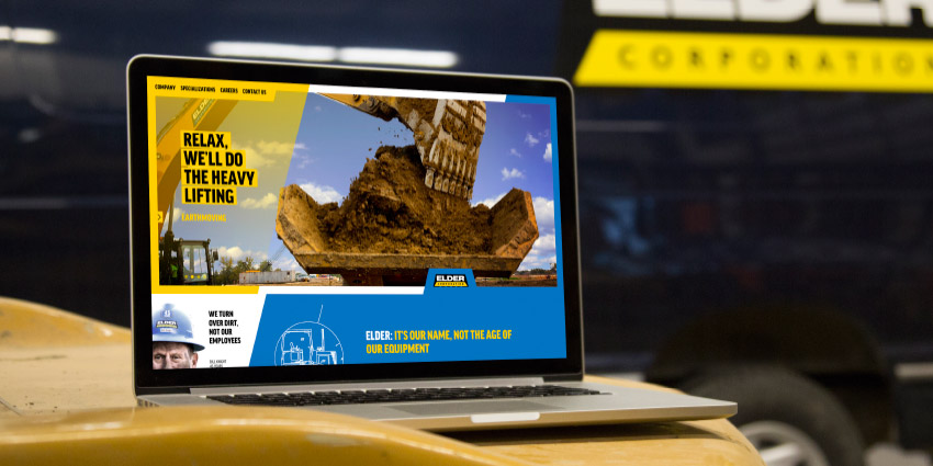
Case Study: View the website work we have done for this client.
Our answer?
It all comes down to strategy. You should be very intentional with every detail of your website, from its content and use of video to landing pages and ultimate goals. What is the exact behavior that you want your visitor to do when they reach your page? Just look at the products, see the pricing and then drop-off your website to go back to watching cat videos on Youtube? Probably not. Think about trying to have your visitor give you permission to market to them, whether that means having a blog subscription they can sign up for, or a piece of content they can download. Then, you’ll have all their contact information in a database – obviously more valuable than letting interested customers come and go unknowingly.
So, how do you get started?
If you’ve not only had the revelation that your website sucks, but that you also need a website that works hard looks good, then it’s time to take the next steps. First, you should take a good look at the entirety of your brand. You might discover that while your website indeed does suck, it might not be the only problem. It’s easy for many company leaders to make a sucky website the scapegoat, and hope that a fix would solve many of your marketing problems. The truth is, your website is probably only part of the problem. The root of all of your marketing problems usually lies within your branding.
Branding is so much more than the look of your logo and website. It extends past the shallow hotness of your site, and into your meaning, behavior and more. The website should be an extension of your brand, and treated as only a piece of the branding puzzle. When you decide it’s time to incinerate your website and start from the beginning, make sure you choose your partner wisely. It’s a great idea to choose an agency that is a partner in branding services, instead of just a vendor of a la carte “one-and-done” services.
Once you are ready to take action on your website, make sure you step back and take a look at your whole brand. If you do, you may find that your website isn’t the only thing that sucks more than a Dyson.


