 Web
Web
Website Navigation and Diamond Rings
It’s important that your website gets engaged with your audience. Get up off your knee and put the engagement ring box back in your pocket; we’re talking about wooing your visitor with unique website navigation. No diamond rings or rehearsal dinners required.
When building a website, you must think about how the user will find information that is important to them. For our advice on what not to do when it comes to web navigation, give this post a look. As a refresher, some of the best web navigation practices include:
- Concise, specific menu labels
- Easy-to-find menu location
- Low number of menu items
- Use language that is your industry’s standard
Over time, we have gotten used to websites being laid out in a certain way. The logo in the left hand corner, the navigation bar along the top of the screen, buttons that say “about us” and “store.” These methods appeal to the implied usability of a site and are behaviors learned by users. A simple answer when it comes to the best practice for your website is that there is no “one size fits all” solution when it comes to building web navigation. While there is no fail-safe formula, we do know that you must provide users with a logical, user-friendly route to find what they are looking for or else they are likely to leave your site in frustration.
You might feel like you are stuck in a boring, rigid site nav world. Not so fast! There are ways to make your site navigation creative and unique, all while keeping it logical and easy-to-use. Here are a few of our favorite site navigation cases that will make you want to pop the question:
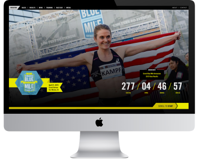
If you feel like you’ve run a marathon after trying to navigate through a website, that’s not a good thing. In the case of Grand Blue Mile, we wanted you to get immersed in the feeling of race day without a tiring site navigation.
Using horizontal scrolling from right to left gave this site a sense of movement. As you scroll, mile markers move along with you. The Grand Blue Mile is all about fitness and running so we wanted to amp this site up with energy. The look of the website is energized with a bright yellow and modern blue. This project was image rich, using compelling photos of athletes running the race.
Iowa Valley Community College District
Marrying four different websites together?! Sounds crazy. In Iowa Valley’s case, having a simple site navigation was crucial to merge four sites into one destination. This website had so much information that it needed large menus for navigation. We created a unique experience for each individual site while still fitting the overall Iowa Valley theme. Since these sites were for Ellsworth Community College, Marshalltown Community College, Adult Education and Administration, we were able to incorporate school colors onto the pages as an indicator of each separate site.
To ensure the site was easy to use, we conducted user-testing with students and potential students to see if they were able to navigate around the site easily. We successfully created a site where you could navigate to other areas in a simple and intuitive way.
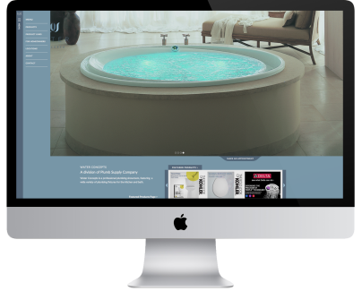
Just like you need water to survive, your site needs great navigation. For Water Concepts, the goal was to create a site that appealed to consumers who are interested in a designer look. This meant providing a fashionable, yet functional, navigation system. By using beautiful product imagery, we were able to create a catalog-like experience.
The navigation features a sidebar menu that provides many drill-down options to bring the user to the specific product they are looking for. The sleek design of this site provides the user with a superior shopping experience.
Whether it is your first date, or you’re planning your wedding, you need to make the commitment to a sensible site navigation system. Remember, you can be unique and creative without being confusing!


